37 Deviantart August Inspirational Pieces
During hard organising and designing work, I was getting so busy I didn’t get any time to create some more valuable articles from my side. Since actual development process is going to end, I will warm up today and feature some of the best artworks from Deviantart to get you inspired. If you recall, I always enjoyed to write some personal thoughts, impressions about almost each specific design and I will try my best again to name points, which really make design to stand out.
Would love to hear your thoughts in the comments, suggestions and impressions which artwork actually stayed in your mind the most. Okay, ready? – let’s get started!
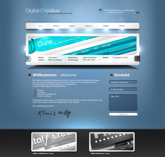
Digital-Creative Portfolio by Para-Project
Beautiful lightning effects through whole site helps to grab attention and create really light and stunning impression. White plus blue gradient looks great here!
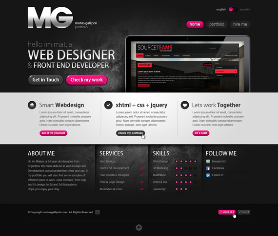
MG Portfolio v2 by mgportfolio
What I liked here the most is texture based in the center of layout really making this design to stand out. Such textures are really easy to use, but as we can see it’s really rewarding – love language switcher and purple on dark as always make right links to stand out. Only thing which is missing for me is great logo, this one just looks little bit not in a place here.
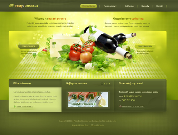
Taste and Delicious by Pilej
Pilej is really talented designer, each of his works are stunning. This work is especially tasteful and delicious, would love to see it live version.
Intentio by edumicro
Really light website showing how everything can be monochrome, almost with no color used – great effect is achieved!
Creative by badboythemer
I just love main navigation shining in front of me, interesting color mix in overall design, though I think those line brushes are a little bit overused here, little less would look better in my opinion.
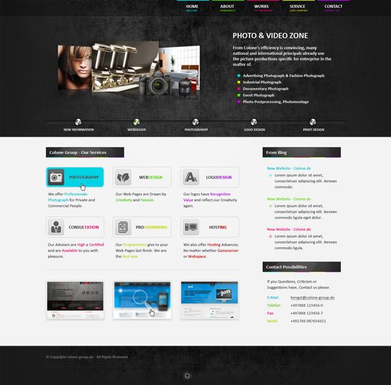
Colone Portfolio No.7 by h1xndesign
Again one more example with beautiful texture doing all the hard background work for you! Dotted lines and colourful navigation look really beautiful as well – case study!
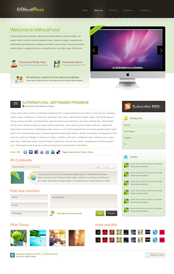
WithoutPress by DouglasEltz
I am really loving light designs lately, this design just come really natural to your eye observing all the information easily. Promising project and notice also main navigation – good presentation and use of color.
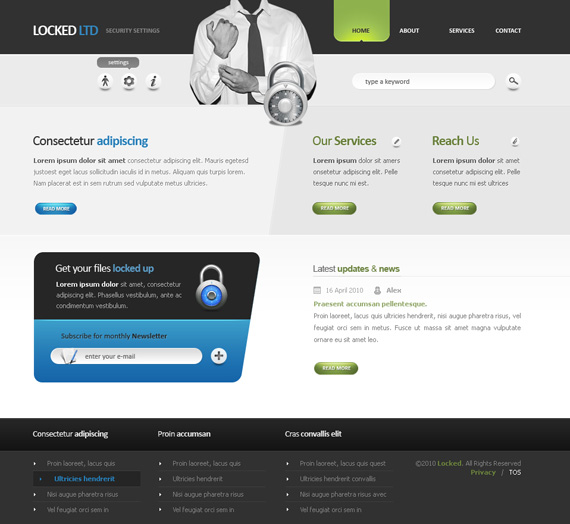
Locked LTD by alexdesigns
This design stands out by NOT using standard table based layouts, but pulling down straight lines and emphasizing right elements like blue/grey section “Get your files locked up”.
Notice that element is far from being at the top of layout, but simple use of bright color and icon does the job perfectly grabbing all the attention to subscribe for their monthly newsletter.
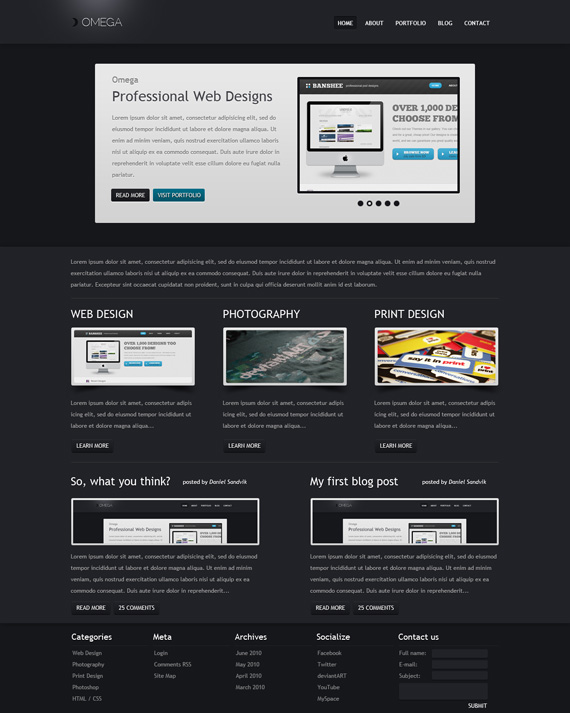
Do you like dark designs? Learn how to create beautiful and easy observable design right here. Only section which I think is not finished is footer, designer could give little more whitespace there to separate content from footer.
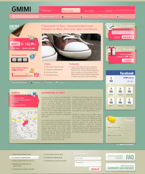
GMIMI portal design by fuxxo
Playful design with a lot of rounded corners and nice gradient effects, interesting and unique style.
Blog On the Wall by F-l-a-g
This design has interesting concept behind it – all the elements are on wall (check that neat search button). Usually designs miss good concept, you can see here nice changes and good thinking.
Take your designs to the next level as well, in your next design do some case study and focus on one topic – like here! It will be a lot easier for you to choose right elements, which you will use, because of natural resemblances.
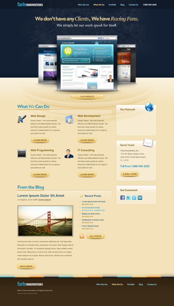
Farin Innovations by alisalem
Tasteful design with interesting 3d look in main section and beautiful texture to emphasize the main message.
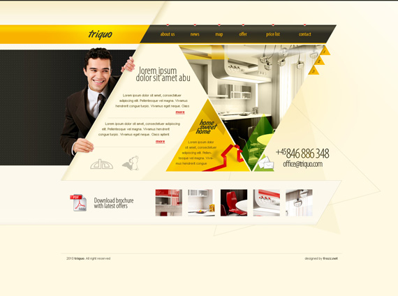
Triquo Page by Frozz
Triangles, triangles, triangles – really interesting concept showing how to think outside the box!
Collins Harper-Web Developers by LOUDAMedia
I cannot image how much designer sat on this one, but outcome is amazing. Great 3d perspective will get you really inspired, at least it worked for me! Carbon and tech websites have become really popular lately, usually such designs are created for application sites like Iphone Apps.
Underwater Diving by DjDillen
Very well executed underwater scene, site is about diving so very appropriate!
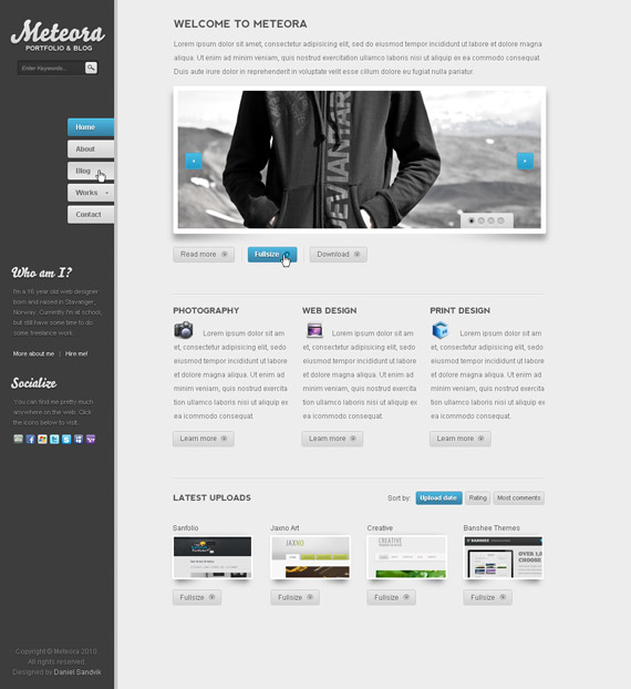
Meteora by Revoken
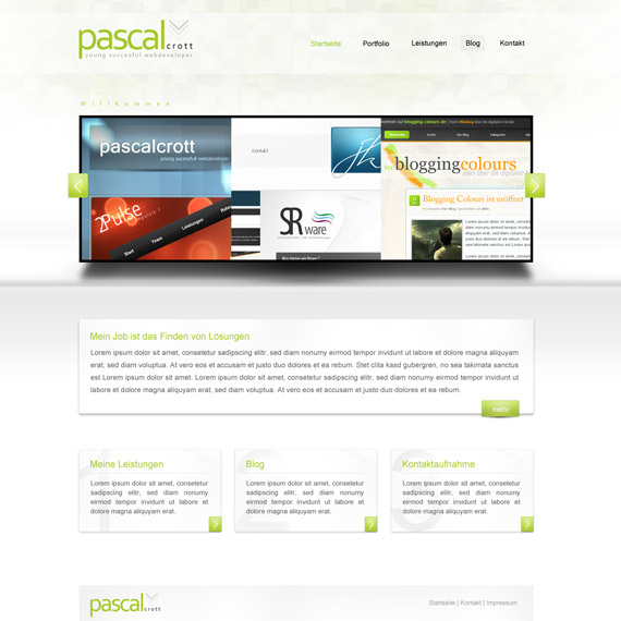
Pascal Crott portfolio v2 by jk9o
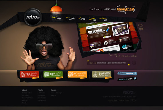
Retro Creative Media by SencerBugrahan
I must agree to comment there “freaking sexy” – beautiful lightning effects and guy with big hair/sunglasses look stunning, cannot imagine anything else suited better for that place.
AVG – Esserio by AntoniaVG
Elementic Portfolio by misht
Very interesting concept without logo at all, just with main header and did you know monochrome can look really stunning and stand out with its subtle elegance? Check out his live website as well with nice mouseover effects.
I was really cheered up because of mention about 1stwebdesigner as one of the sites “Where I learn from”!
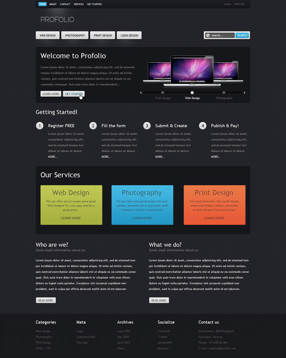
Profolio by Revoken
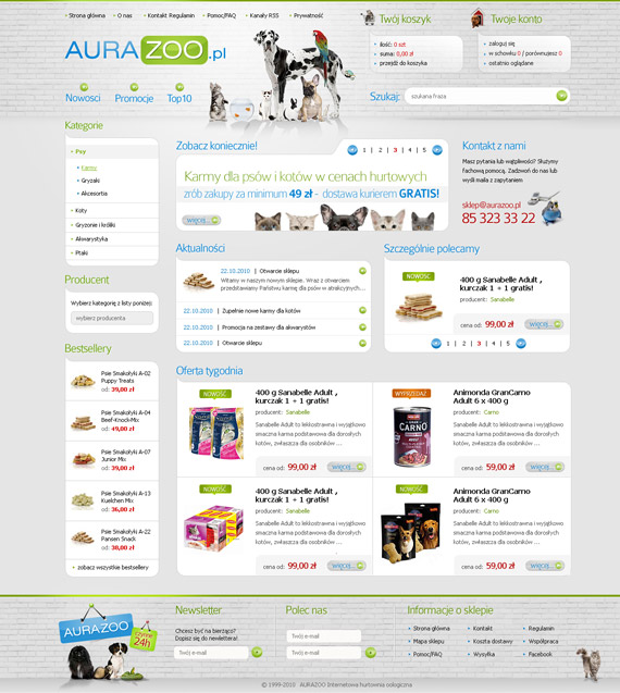
Aura Zoo 2 by finesy
Learn how to consume and showcase a lot of information in good way, nice texture in background.
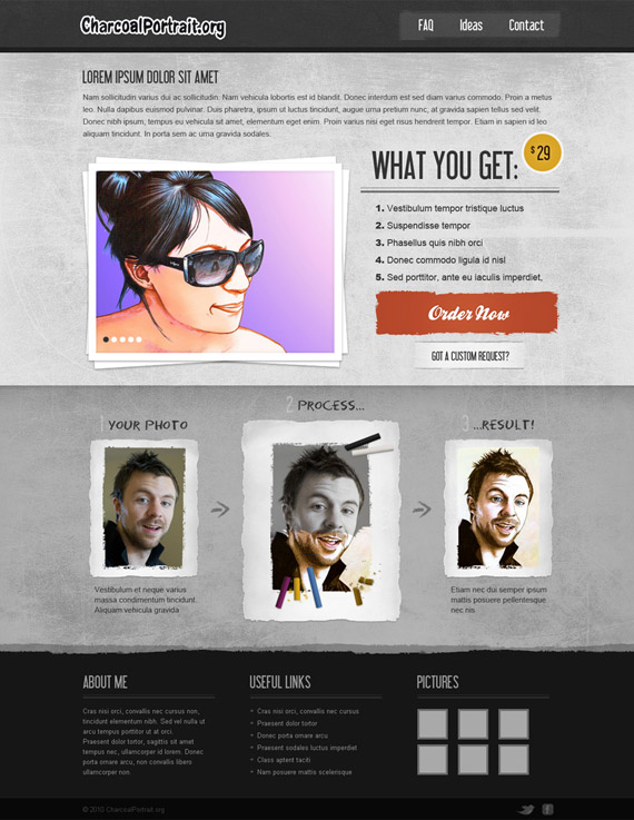
Charcoal Portrait by skriki
Nice use of textures and overall design is really good executed bringing the right message to advertise their product in 3 simple texts. Only thing here to change would be smart logo, good branding is lacking here.
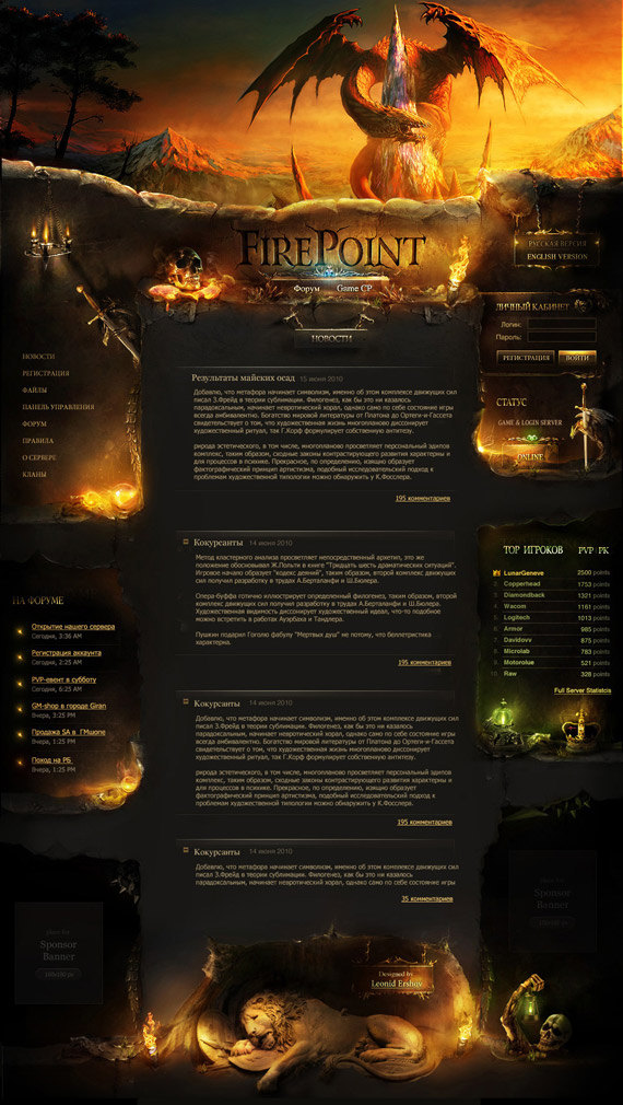
Firepoint by zygat3r
Gaming fans will love this design, my favorite section is bold title “’Firepoint” and the way how it looks engraved in stone.
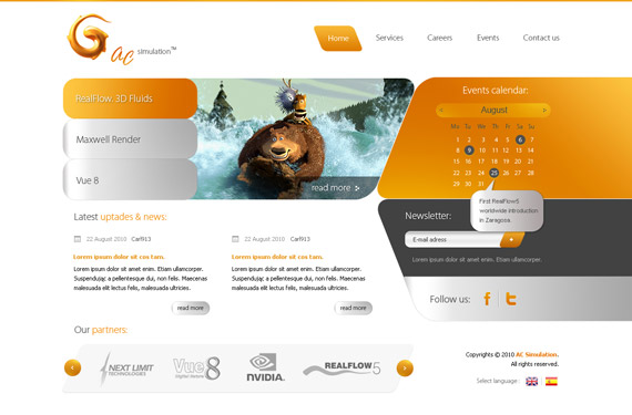
AC Simulation Site by carl913
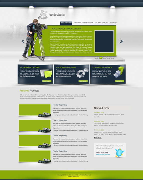
Fresh studio website by REDFLOOD
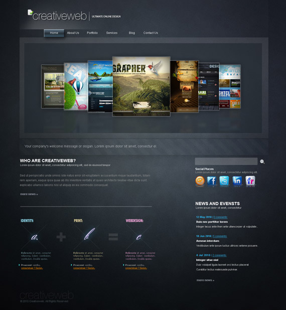
Creative_Web by arEa50oNe
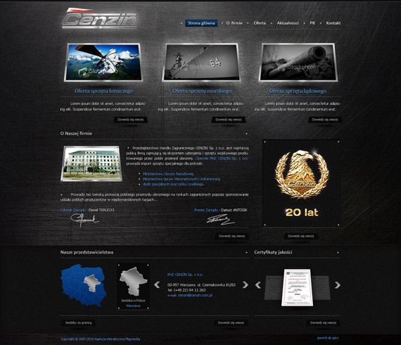
Cenzin redesign by t3t5uo
ELEXION – For Sale by AndasoloARTS
Primakomp BWI by ryzzus
Business Layout by zottel89
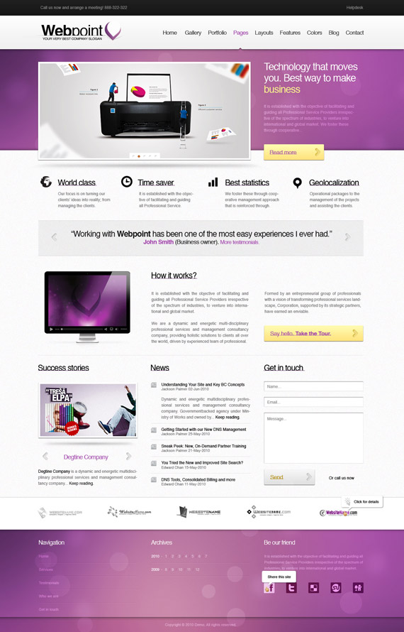
WebPoint business template by gabshot
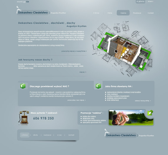
Roofing company by kegajewski
Phenomart Portfolio by phenomart
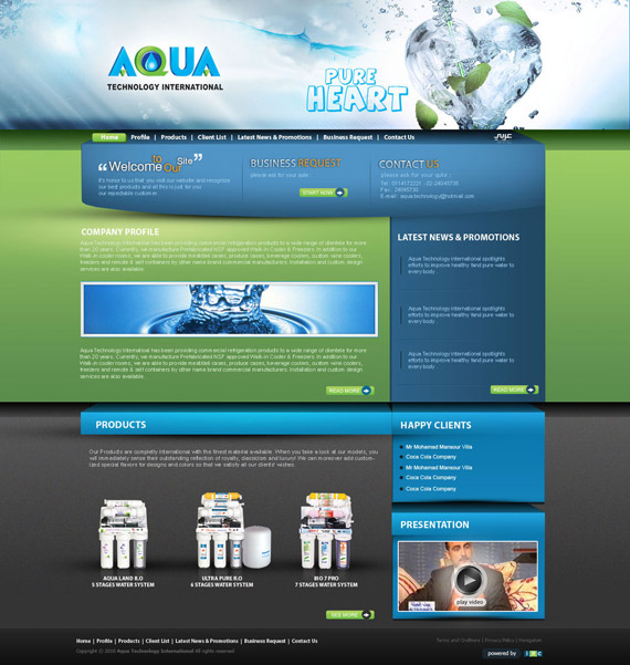
Aqua water system by atcreation
Ah this is it – I must say my apologies for such short inspirational list, but truth is – I really wasn’t able to find that much great artworks, which deserved to be showcased here! However enjoy this showcase – currently trends aren’t changed, just getting more and more polished.
Keep updated and let’s watch together what September will bring to us :)
